Map coloring


Dare to go in black
Nowadays, finding maps in their original colors is becoming a challenge. Many uncolored maps are now being colored to make them more sellable for the public.
An uncolored map or print with a strong, dark impression is an absolute pleasure. Early imprints are recognizable at the plate tone.
Specific maps were not colored at the time of publication. Most editions of Robert Dudley's sea charts and Vincenzo Coronelli's maps are examples of maps that were usually not issued in color. Most collectors looking for these maps expect to buy them without color and would find modern colored examples less valuable than uncolored examples.
Price-wise
A map in its original color will sell for more than double the price of the same map, uncolored or with recently applied colors.
In almost all cases, reputable dealers can distinguish between old, later, and modern colors and note whether a map is original, later, or recent.
Nowadays, finding maps in their original colors is becoming a challenge.
Please note that an uncolored copy in a strong, dark impression is a pleasure.
We prefer a map in an early imprint with the plate tone in its original black and white condition above a newly colored map.
Several well-respected colorists existed in their day. The most well-known was Dirk Jansz Van Santen, who colored the well-known Atlas Vander Hem. Other colorists are Frans Koerten, David Reerigh, and Anna Beek. Many of them used lavish gold and silver to highlight titles and cartouches, and these maps sell at 3 to 5 times the value of a colored example.
Whether color or black and white looks better (or is worth more) is a matter of personal preference.
Printed maps, either by woodblock, copper, or steel engraving, were usually bound into an atlas, and a larger number were sold in black and white.
However, a substantial number were colored by hand, and a very small number were even heightened with gold or silver. As many atlases produced during the 16th—17th century were produced for rich merchants, noblemen, and collectors, many of these atlases were colored for decorative reasons.
The fact that colors make the map more readable was best understood in the 18th century. Mapmakers like Homann, Seutter, Schenk, Valck, Covens and Mortier offered their atlases almost exclusively colored.
Typically, the countries are colored full-body, and cartouches are left uncolored. Map-makers have long known that four colors (green, yellow, orange, and pink) are sufficient to color a map.
We see that the fashion of coloring maps followed the changing style of engraving. The early Lafreri-type maps are usually not colored. But starting with the maps of Ortelius, Mercator, and de Jode, the maps have a border color with a wash color for the regions.
In the early 17th century, the borderlines were typically bold colors, and the cartouches used fewer colors and were boldly applied (J.Hondius, Plancius, C.J. Visscher, Speed).
The copper engraving became finer, as the maps became more detailed and the cartouches more profane, the coloring became more delicate and finer.
Various materials were used as sizes to prevent the paper from absorbing the color too rapidly or unevenly, the white of an egg being the most common.
Judging from books on the subject, some colorists went to great lengths to obtain the correct color, the constituents coming from all over the world and taking several days to prepare.
These colors are generally remarkably good. Since they were applied, they have retained their brilliance and shown little sign of fading.
The greens can cause some trouble: they were made from verdigris, which rots through the paper to the extent of disintegration over time.
Detecting old versus new coloring.
From the color pigments applied on colored maps, usually, the green shows
oxidation on the back. Renaissance colorists made the green color using Sulfuric acid or Copper in the form of verdigris mixed with wax was used to make the green color.
Oxidation refers to the chemical changes a substance undergoes when exposed to the elements. The color change from copper oxidation tends to darken to a deeper brown or rust color.
In the first place, the paper will darken, and afterward, the color itself.
Oxidation leads to the corrosion and corruption of the paper. In most cases, the oxidation on the verso is visible. When thick and very good paper quality was used, oxidation is not always visible on the verso.
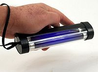 The most commonly used lighting tool to detect oxidation is a long-wave ultraviolet lamp in the 365-nanometer range. At this wavelength, many materials absorb invisible ultraviolet energy and
transform it into visible colored light, easily distinguished by the human eye. The test can be done in a dark area or room by holding the UV lamp to the verso of the map. Typically, the area that has green applied will be absorbed without emission, making these areas appear quite dark in contrast to the
fluorescent areas.
The most commonly used lighting tool to detect oxidation is a long-wave ultraviolet lamp in the 365-nanometer range. At this wavelength, many materials absorb invisible ultraviolet energy and
transform it into visible colored light, easily distinguished by the human eye. The test can be done in a dark area or room by holding the UV lamp to the verso of the map. Typically, the area that has green applied will be absorbed without emission, making these areas appear quite dark in contrast to the
fluorescent areas.
Certain pigments also have signature fluorescences: -madder or alizarin red show pink in UV, for instance, a zinc white (which has been used since the nineteenth century appears yellow.
Iron gall ink, common brown writing and drawing ink used from medieval times
through the 19th century, when it faded from visibility, remains detectable under
ultraviolet light.
Ultraviolet (UV) light causes the old paper to fluoresce faintly whitish, yellowish, or grayish, but modern paper glows bright bluish-white. Mildew (foxing) appears yellowish and makes water stains easy to recognize. Old vellum appears yellowish-white or ivory, but modern
vellum appears bluish-white.
During World War II, airplanes used maps written in UV fluorescent ink. The navigator could read the map during dangerous battle situations without illuminating the cockpit.
Colour pigments used are :
Azurite
A greenish-blue pigment named after the Persian word "lazhward", meaning "blue", it is chemically close to the green colorant malachite. Azurite was known from ancient times and became extremely popular during the Middle Ages and the Renaissance era, as Egyptian Blue declined. Used in oil painting, it performed best as a water-based pigment and was often employed in Tempera paint under an oil glaze. Superseded by Prussian blue in the early 18th century and rendered obsolete after the synthesisation of Ultramarine and the development of Cobalt Blue.
Copper Resinate
Known since the mid-Byzantine era (c.800 CE), this is a transparent jade-green glaze made by dissolving copper salts in Venice turpentine. It was used particularly by Post-Renaissance 16th-century Italian oil painters to color foliage.
It was commonly combined with azurite paint and layered over lead white or lead-tin yellow pigments.
Lac
A red colorant made initially in India gave rise to the term "Lake", meaning any transparent dye-based color precipitated on an inert pigment base used for glazing. During the High Renaissance in Italy, Lac was the third most expensive pigment (after gold and Ultramarine), but most artists thought it was worth the expense.
Lapis Lazuli (Ultramarine)
The source of the fabulous, absolutely permanent, and non-toxic natural blue pigment Ultramarine, the precious stone Lapis Lazuli is found in Central Asia, notably Afghanistan. It was employed in ancient times as a simple ground-up mineral (Lapis Lazuli or Lazuline Blue) with weak color power. Then Persian craftsmen discovered a means of extracting the coloring agent, creating a hugely important art material at a stroke. Ultramarine arrived in Venice on Arab boats during the Renaissance and was named the pigment from overseas ("ultra marine"). Its brilliance rapidly attained a price that only princes and large wealthy religious organizations could afford it. Although strongly associated with Renaissance art, it is still widely used by contemporary painters, especially since prices and supply have improved. Synthetic Ultramarine is chemically identical, although it typically appears in a more reddish shade. However, it's far lower price will no doubt ensure that genuine Ultramarine remains in limited usage.
Lead-Tin Yellow
A highly stable, bright, opaque yellow was used from around 1250 until the mid-17th century, when its use ceased abruptly for no obvious reason. Experts believe that its formula might have been lost due to the death of its producer. Very popular with Renaissance painters, who used it in foliage and earth pigments, Lead-Tin Yellow seems to have many attributes of modern Cadmium Yellow, but little was known about it until the 1940s. Since then, it has enjoyed a modest recovery.
Madder
A natural plant colorant obtained from Madder plants in a process dating back to Antiquity.
It was brought back to Europe during the time of the Crusades. It was one of the most stable natural pigments. Dyes derived from the root of the Madder plant were used in ancient Egypt for coloring textiles. Later, natural madder pigments were used by 15th and 16th-century painters. Natural production virtually ceased after a synthetic version was invented in 1868 by the German chemists Grabe and Lieberman.
Ultramarine
Natural Ultramarine, made from the precious stone Lapis Lazuli, was (and remains) one of the world's most expensive artists' pigments. A cool, deep blue hue, it was first used in 6th-century Afghanistan, and the pigment achieved its zenith during the Italian Renaissance as it harmonized perfectly with the vermilion and gold of illuminated manuscripts and Italian panel paintings. However, being vulnerable to even minute traces of mineral acids and acid vapours, it was only used for frescoes when it was applied "secco" (when the pigment was mixed with a binding medium and applied over dry plaster) as in Giotto di Bondone's famous fresco cycle in the Cappella degli Scrovegni Chapel in Padua. Ultramarine was finally synthesized independently by Frenchman Jean Baptiste Guimet and the German chemist Christian Gottlob Gmelin in the late 1820s/early 1830s. The artificial colorant was non-toxic and as permanent as the natural variety but darker and less azure. It was formulated for both oil and watercolor paints.
Verdigris
A standard synthetic green pigment used from Classical Antiquity until the 19th century, it was the most vibrant green available during the Renaissance and Baroque eras. Its relative transparency led to it being frequently combined with lead white or lead-tin yellow or used as a glaze. The name derives from the Old French word "vertegrez", meaning "green of Greece". Its use declined sharply from the 18th century onwards.
Vermilion (Vermillion)
An orange-ish red pigment with fine hiding power and good permanence, but high toxicity. Natural Vermilion, known to the Romans as Minium, comes from the mineral ore Cinnabar (see above), and the name Vermilion is most commonly used to describe the synthetic version of the pigment, which nowadays is usually obtained by reacting mercury with molten sulfur. In Antiquity, Vermilion/Cinnabar was highly prized, being ten times more expensive than red ochre. Later, it was an important colorant in illuminated manuscripts, although it remained prohibitively expensive until the 14th century, when a synthetic version was first produced. Vermilion was the traditional red pigment in Chinese art and is the colorant used in Chinese red lacquer. Today, Vermilion has been replaced in a painting by the pigment cadmium red.
Different centuries, different countries, different coloring.
The 16th century used body colors, but the 17th-century colorist preferred outline color. The Germans used full-body color, with uncolored cartouches.
Samples of coloring
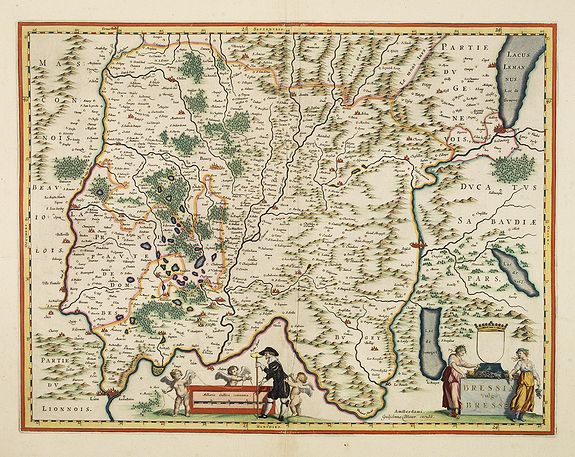
15th-century coloring. Harmann Schedel's world map from the Nuremberg Chronicle.

16th-century full coloring, typically Ortelius, De Jode. Note that the sister of Ortelius, Anna, seems to be a well-known map colorist. Ortelius also colored maps himself in his early days.


Early 17th-century Dutch coloring, applied before 1640 (Border colors are applied much bolder than in the second half of the 17th century. Typically by C.J. CVisscher and J. Hondius.)

Dutch coloring was applied after 1640 (Border lines are now much finer and more delicately applied)
 >
>
Exceptional coloring.
Wealthy collectors, Kings, noblemen, and rich merchants ordered atlases to be colored in exceptional colors and sometimes heightened in gold and silver. Some colorists are known. Dirk Jansz van Santen was the most famous. Others are
 His manner is signified by rich and exotic color combinations, added elements such as flowers to clothing, and marbling to masonry. Goedings: "Van Santen applied transparent and opaque colors simultaneously in mixed and pure tints. He often painted the whole surface of the map or illustration, transforming the graphic light and dark contrasts into color.
He applied his characteristic shiny varnish, which had the effect of brightening the color, frequently making use of the same color progression."
Atlases and books colored by van Santen are found in the libraries of the most prominent collectors of the
golden age of Dutch cartography ". Bibles and atlases, bound in deluxe bindings by Albert Magnus (1642-1689) and decorated by van Santen were considered gifts worthy of princes. Travelers and poets wrote about this work" (Goedings).
More about Dirk Jansz van Santen >>>
Another famous Dutch colorist was Frans Koerten (1603-1668), an illuminator, bookseller, and collector, whose stock and the private collection were sold at auction in Amsterdam in 1668, and was also an engraver and publisher of prints.
 Mrs. Anna Beek of the Hague. She enlarged
prints, initially published by Hogenberg or Merian, and colored them in pastel colors, adding extensive
clouds and brilliant yellow borders. The height of the print is enlarged by ca. 8 cm (3 inches). This way of enlarging prints is also known from the famous Van der Hem/Prinz Eugen Atlas and those in the former Royal print collection kept in Jemniste in Czechoslovakia. More about Anna Beek >>>
Mrs. Anna Beek of the Hague. She enlarged
prints, initially published by Hogenberg or Merian, and colored them in pastel colors, adding extensive
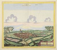
clouds and brilliant yellow borders. The height of the print is enlarged by ca. 8 cm (3 inches). This way of enlarging prints is also known from the famous Van der Hem/Prinz Eugen Atlas and those in the former Royal print collection kept in Jemniste in Czechoslovakia. More about Anna Beek >>>Mid-18th-century coloring. (Full body color and uncolored cartouches.)
In the mid-18th century, fashion changed and maps were colored in full body colors and cartouches were left uncolored. The full colors in contrast to the boldly engraved black and white, are quite striking.
Unfortunately, many cartouches are nowadays colored up and destroy the dramatic contrast.


Dare to go in black
Nowadays, finding maps in their original colors is becoming a challenge. Many uncolored maps are being colored to make them more sellable.
Please note that an uncolored copy with a strong, dark impression is a pleasure.
Early imprints are recognizable at the plate tone. The engravers of the 16th century are some of the greatest engravers ever. Samples are Jodocus Hondius, van Langren, and Claes Jansz. Visscher, Petrus Karius,
Frans Hogenberg.
Specific maps were not colored at the time of publication. Most editions of Robert Dudley's sea charts and Vincenzo Coronelli's maps are examples of maps that were usually not issued in color. Most collectors looking for these maps expect to buy them without color and would find modern colored examples less valuable than uncolored examples.
Price-wise
A map in its original color will sell for more than double the price of the same map, uncolored or with recently applied colors.
In almost all cases, reputable dealers can distinguish between old, later, and modern colors and note whether a map is in original, later, or recent colors.
Nowadays, finding maps in their original colors is becoming a challenge.
Please note that an uncolored copy in a strong and dark impression is a pleasure.
We definitely prefer a map in an early imprint with the plate tone in its original black and white condition above a newly colored map.
Several well-respected colorists existed in their day. The most well-known was Dirk Jansz Van Santen, who colored the well-known Atlas Vander Hem. Other colorists are Frans Koerten, David Reerigh, and Anna Beek. Many of them used lavish gold and silver to highlight titles and cartouches, and these maps sell at 3 to 5 times the value of a colored example.
Whether color or black and white looks better (or is worth more) is a matter of personal preference.
Putting the World in Its “Proper Colour”: Exploring Hand-Coloring in Early Maps.
A fascinating article by Stephanie Elizabeth Stillo explores the utility of X-Ray Florescence (XRF) in identifying pigments used in early hand-colored prints. Published accounts of the use of XRF on hand-colored documents are rare.
In collaboration with the Preservation, Research, and Testing Division (PRTD) at the Library of Congress, this study compared early coloring manuals with XRF analysis of printed and hand-colored cartographic compilations from Amsterdam (Fredrik de Wit, Atlas, c. 1688 printing) and London (Richard Blome, Geographical Descriptions of the Four Parts of the World, c. 1670 printing).
Conclusion: The study also exposed surprising actors and highlighted XRF's exciting potential to verify the historical authenticity of hand-coloring.
With so many maps these days colored up to make them more commercial and ingenious colorists who know better how to imitate old colors and the aging process, this article by Stephanie Elizabeth Stillo is of great interest. [pdf]